
One month into my time at November Five, it felt like the right moment to share some of my knowledge with my colleagues. I knew exactly which topic to pick.
Most people treat copy as the thing you add once the design is done: a headline here, a button label there, some words to fill the boxes. I see it the other way around. Words shape a design from the very first sketch. So I signed up to host a Munch & Mingle, our lunch sessions at November Five where one person shares a topic they love while everyone eats, and set out to prove it.
The session covered how words shape decisions. First we looked at the craft of writing copy, then at content and messaging, and finally at behavioural design and the small nudges that steer what people choose. My goal for the room was one clear idea: a handful of words can make or break a design.
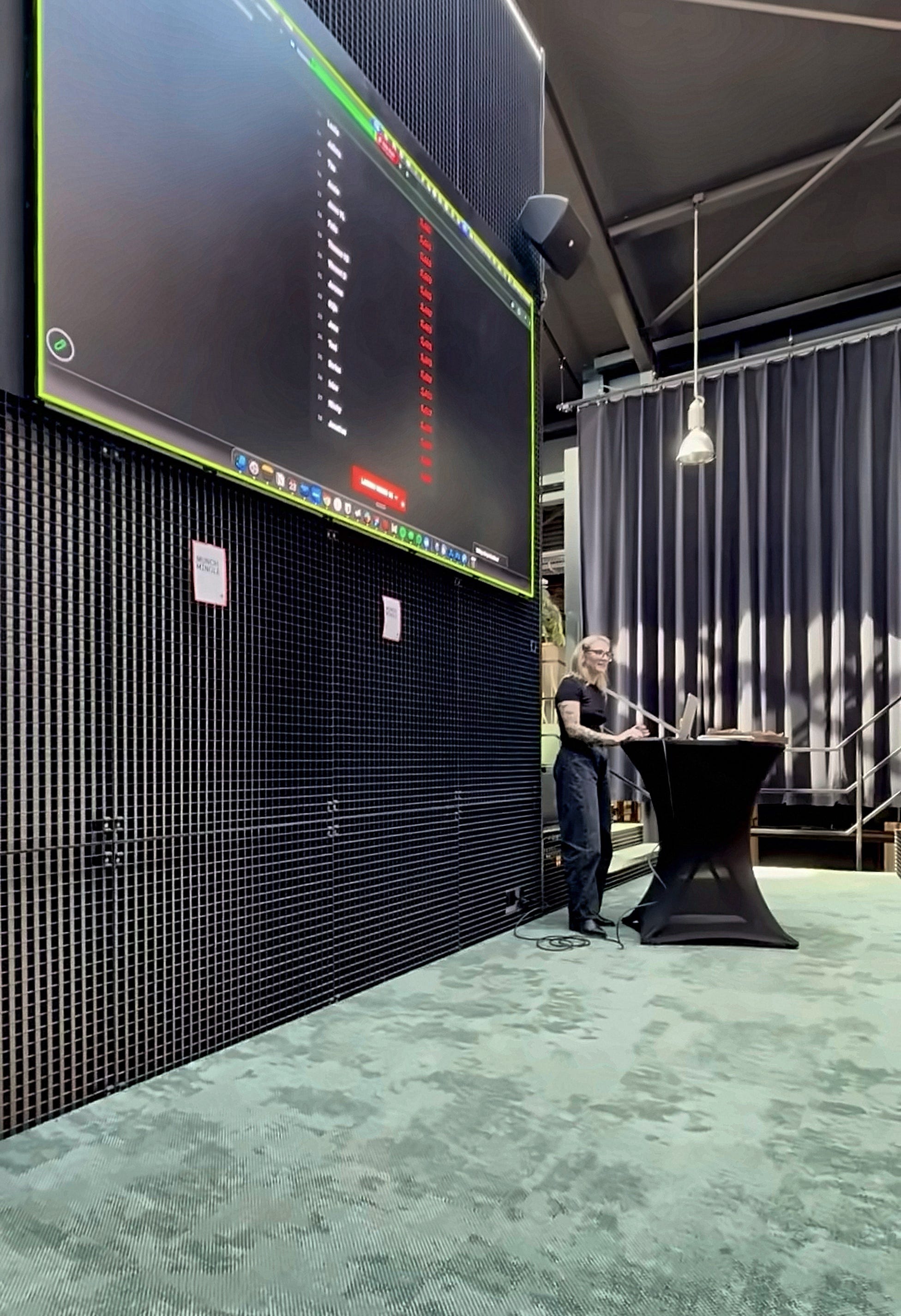
Bad news sticks
I opened with two quick questions. First: raise your hand if you remember a compliment someone once gave you. Then: raise your hand if you remember something negative someone once said to you.
Most of us recall the second one faster and in sharper detail, even when the compliments were bigger and came more often. That’s negativity bias: a negative word leaves a deeper mark than a positive word of the same size. The room jumped in with enthusiasm, and the point landed right away. Every word we write carries weight, so it pays to choose each one on purpose.
One word, 34% more yeses
One of my favourite slides covered a classic study from 1978. Researchers asked to cut in line at an office copier. “Excuse me, may I use the Xerox machine?” got a yes 60% of the time. Adding a reason, “because I’m in a rush,” pushed that to 94%.
The best part: “because I have to make copies,” a reason that explains nothing at all, still scored 93%. The word because did the heavy lifting. One small word changed how people responded, and that’s the whole case for taking copy seriously in a single experiment.
The quiz that fought back
I built an interactive quiz in Figma Make so everyone could test themselves on the techniques we covered. It fought back. I was still fixing technical problems five minutes before the start. Then it worked, and once it ran, it ran perfectly.
When I announced a quiz with points, the room lit up and everyone’s competitive side came to the surface. The points were worth exactly zero, and people wanted them anyway. Twenty-eight colleagues played through twelve questions, and the scores stayed neck and neck right to the top of the podium.

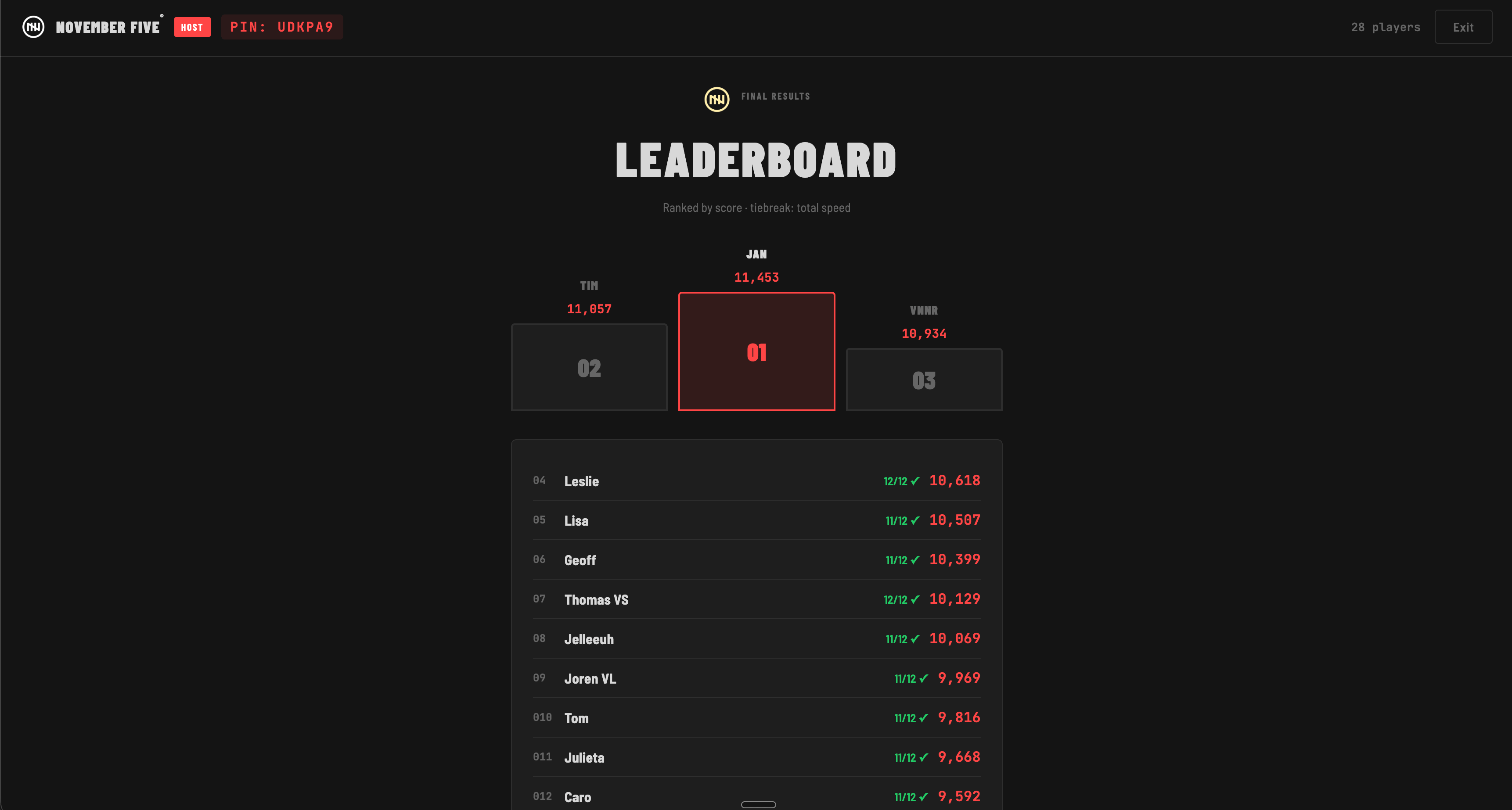
For a talk about behavioural design, that was a perfect live demo: a sense of progress motivates people as much as a prize does. Seeing your name climb a leaderboard is reward enough.
The quiz became the part that stuck. One colleague told me they thought they understood the content, and only when they had to apply it did they see where their understanding stopped. Another said every Munch & Mingle should have a quiz. That first comment stays with me, because it names the real gap. Recognising a principle while someone explains it is easy. Spotting it in a real sentence is a different skill, and a test is what shows you where you stand.

Nudge or dark pattern?
The trickiest question of the day was telling a nudge apart from a dark pattern. Both use the same psychology. Both steer a choice. The difference lies in whose interest they serve.
A nudge helps people do something they already want to do. It stays transparent and easy to undo. A default setting that saves energy, with a clear switch to change it, is a nudge. A dark pattern steers people toward what the company wants, at their expense. A decline button that reads “No thanks, I prefer paying full price” is a dark pattern, because it uses shame to push a choice.
A simple test helps: would the person thank you if they saw exactly what you did and why? If the answer is yes, you’re nudging. The fact that so many people found this hard proves how thin the line is, and how much care it takes to stay on the right side of it.
Ending on chocolate
The peak-end rule says people judge an experience mostly by its most intense moment and by its ending. So the session ended with brownies for everyone, gluten-free ones included. If you teach behavioural design, you may as well use it on your audience. Everyone left with a full stomach and a fresh way of looking at copy.
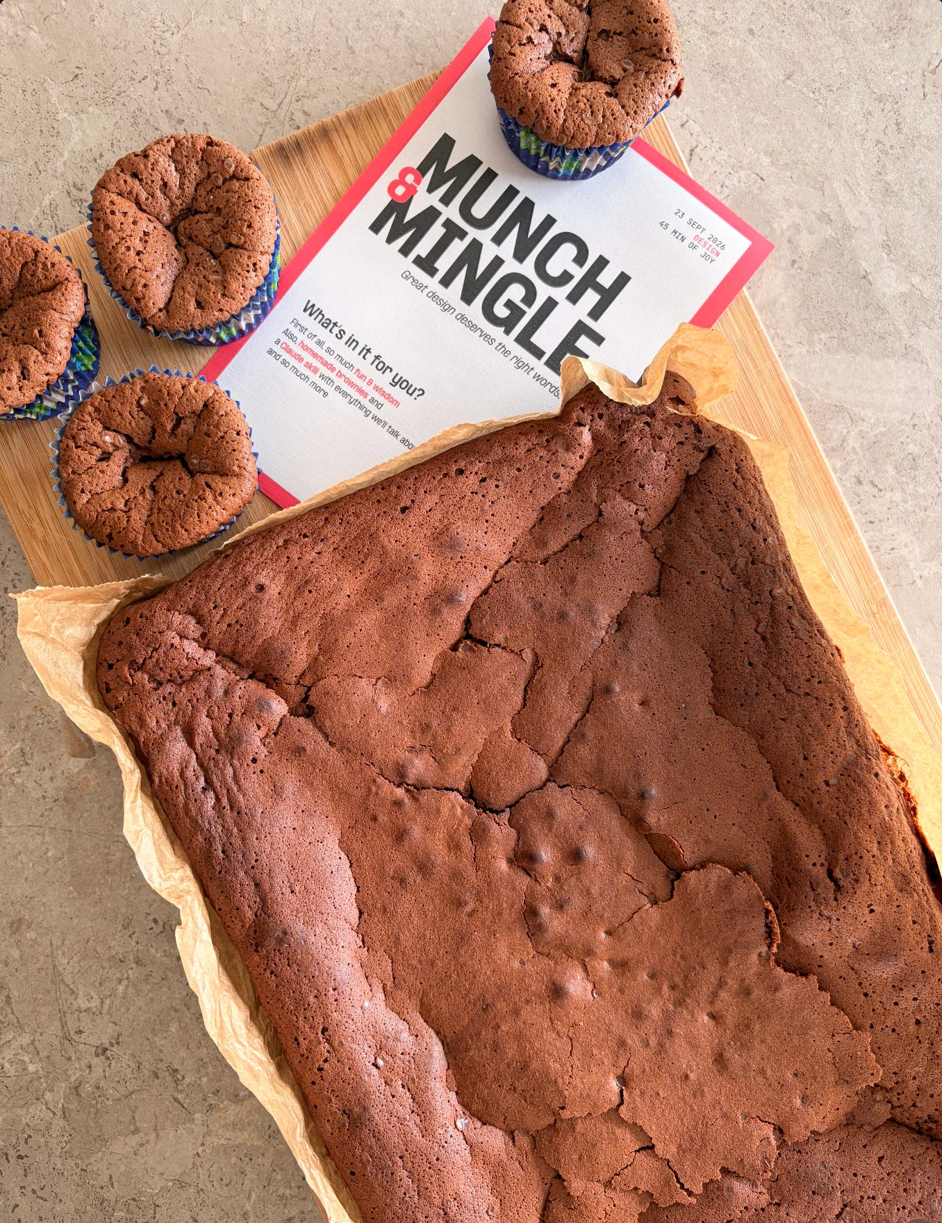
To keep that new perspective alive, everyone also got the Claude skill I built. It combines everything from the presentation and much more: extra principles, techniques, and examples, all ready to use in daily work. Ask it to review a piece of copy, suggest a better nudge, or check whether a design crosses into dark pattern territory. The cheat sheets for copy, content, and nudges live in our knowledge base, together with documentation on each topic, so the principles stay within reach long after the last brownie is gone.
What comes next
The response was warmer than I expected. My most useful feedback was simple: slow down and breathe. It had been a while since I last presented in English, and nerves sped me up. The content held up well. Next time, I give it more room to land.
I’m reshaping the presentation for the next edition. Every theoretical part gets more examples, each with a clear do and don’t side by side. The slides get lighter on text and stronger on visuals, so the ideas land at a glance. A few colleagues left feedback and compliments in our HR tool, on the presentation, the brownies, and the Claude skill alike, which was a lovely surprise.
Three things to take with you
1. Give a reason, and say “because.” As the Xerox study shows, people respond to a reason, even a thin one. When you ask users to do something, such as share their location, turn on notifications, or fill in a field, tell them why. It’s the easiest win in copywriting.
2. Behaviour = Motivation × Ability × Prompt. BJ Fogg’s model says a behaviour happens when all three come together at the same moment. When users hesitate, the instinct is to push motivation harder with more convincing copy. The bigger lever usually sits in ability and prompt: make the action simpler, and put a clear prompt right where people need it.
3. Phrase it positively. Negativity bias works on every reader. “Your password needs 8 characters” lands better than “Invalid password,” and “Easy to set up” beats “Not complicated.” Say what is possible, and people follow more readily.
A handful of words can make or break a design. So next time you open a new frame, start with the words. Copy is part of the design.